OSRS Membership Conversion
Improving free-to-play conversion through iterative A/B testing, achieving a 20% uplift in membership sign-ups.
Old School RuneScape's membership page was a critical conversion point — the moment free players decided whether to unlock the full game. Working with the Product Manager and Marketing team, I led a series of design experiments aimed at improving F2P to P2P conversion.
Rather than a single redesign, we took an incremental approach: testing discrete changes through A/B experiments to build evidence for what actually had a positive impact.
Background
Context
The existing membership page presented pricing and benefits, but lacked clarity around package hierarchy and the tangible value of upgrading. Players landing on this page were already interested — they'd clicked through from the game or website but the conversion rate suggested we were losing them at the final hurdle. The business goal was clear: improve F2P to P2P conversion, a key revenue KPI.
The design challenge was understanding which elements of the page were creating friction and which changes would build enough confidence to convert.
Challenge
Redesigning a high-traffic conversion page carries risk — changes that seem logical can backfire without testing. We needed an approach that balanced ambition with caution, allowing us to validate hypotheses before committing. Using Framer for rapid prototyping and Kameleoon for A/B testing, we structured an experiment roadmap that would progressively introduce changes, measuring impact at each stage.
The challenge was designing variants that tested specific hypotheses rather than bundling too many changes together, which would obscure what actually drove results.
Designs
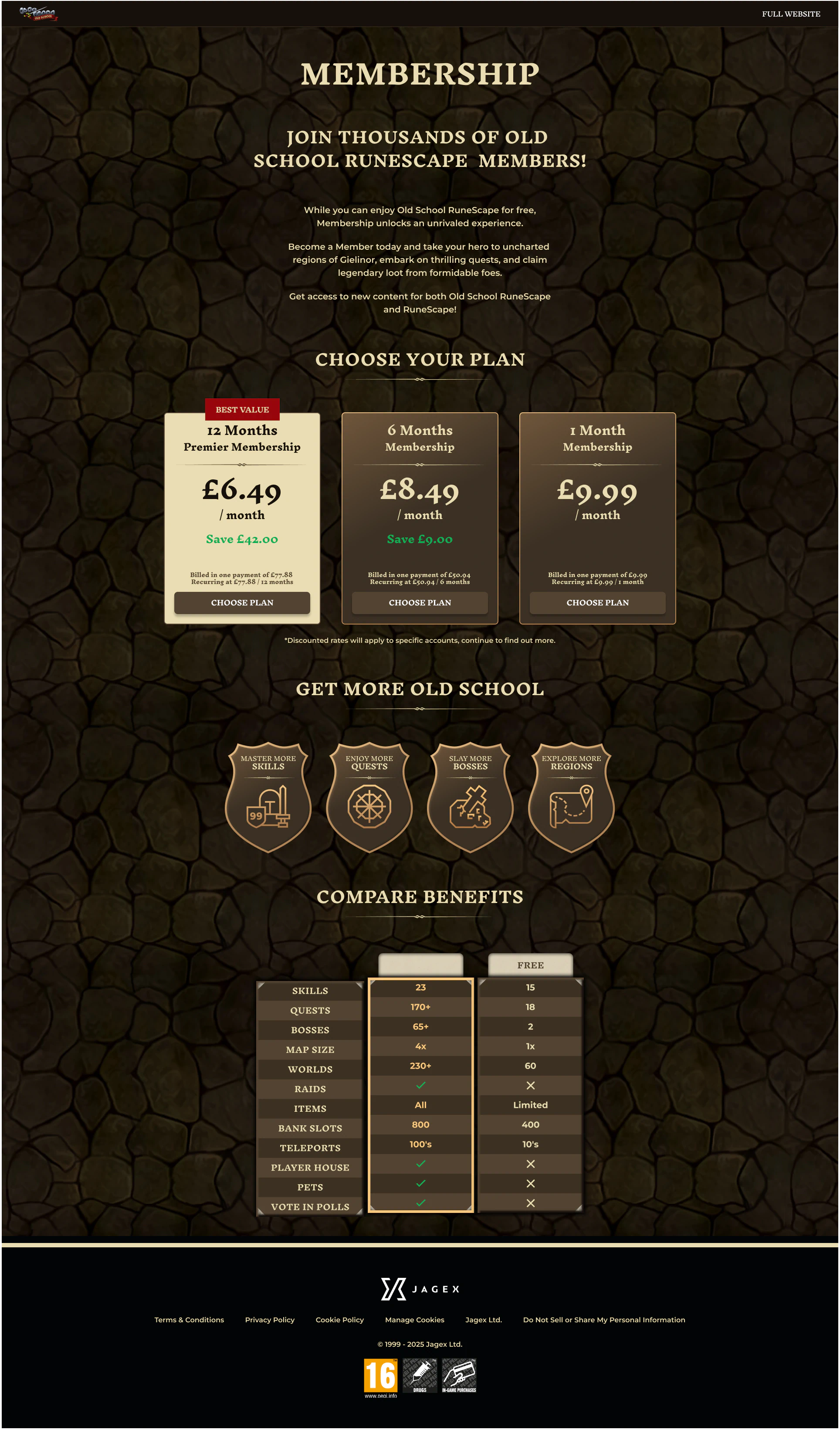
Original Design
The existing membership page presented pricing and benefits, but lacked clarity around package hierarchy and the tangible value of upgrading. While the information was technically present, the visual hierarchy didn't guide players toward a decision—leaving them to parse options without clear differentiation or a compelling reason to commit.
OSRS Membership Design #Control
Design #A
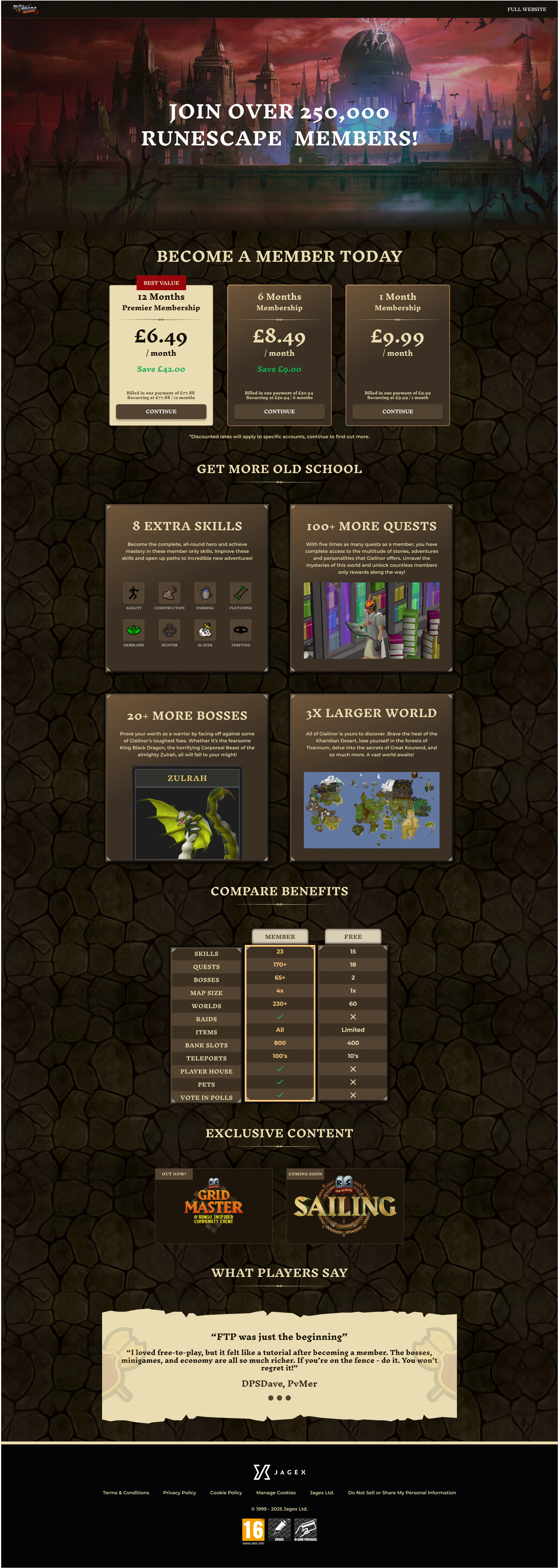
The first variant focused on foundational clarity: improved pricing presentation, clearer package hierarchy, and goal-oriented copy like "Get more Old School" that spoke to player motivation. I redesigned the benefits comparison to better highlight member advantages through visual hierarchy and colour differentiation, making it immediately obvious what players would gain by upgrading.
OSRS Membership Design #A
Design #B
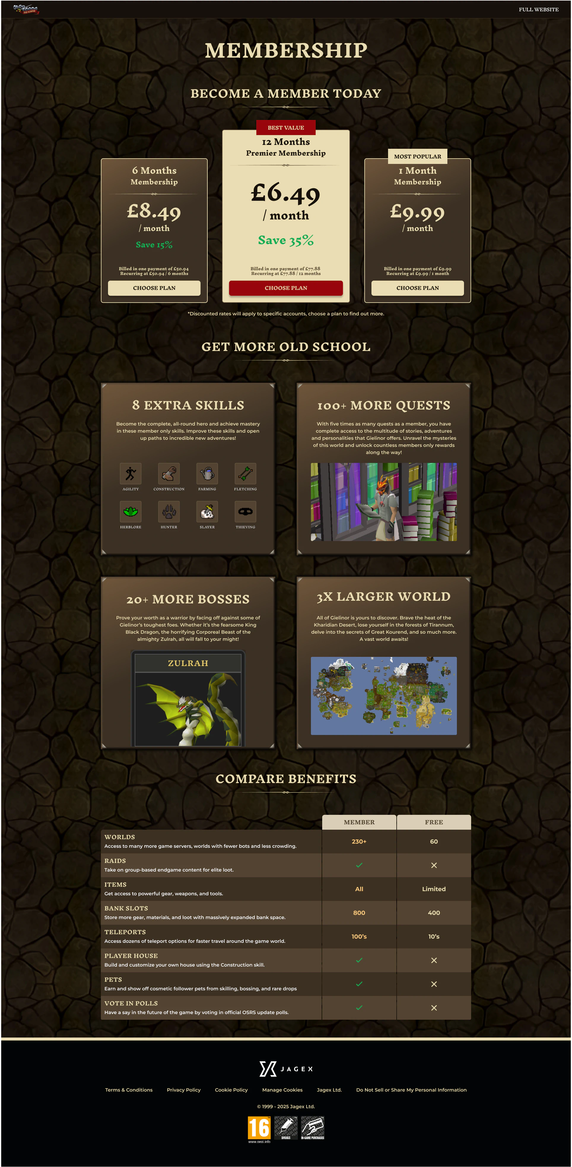
This variant tested whether visual anchoring could drive higher-value purchases. I added prominent visual weighting to the 12-month plan—the best value option—and introduced visual panels showcasing key member benefits using authentic in-game imagery. The benefits comparison table evolved to include descriptive text explaining each feature, helping players understand the value rather than just seeing a checklist of items.
OSRS Membership Design #B
Design #C
Design C explored progressive disclosure for benefit details. Rather than cramming information into the main page, I introduced modals that expanded to show richer benefit explanations when players wanted to learn more. This approach tested whether reducing initial cognitive load while providing depth on demand would improve conversion—letting curious players dig deeper without overwhelming those ready to purchase immediately.
OSRS Membership Design #C
Design #D
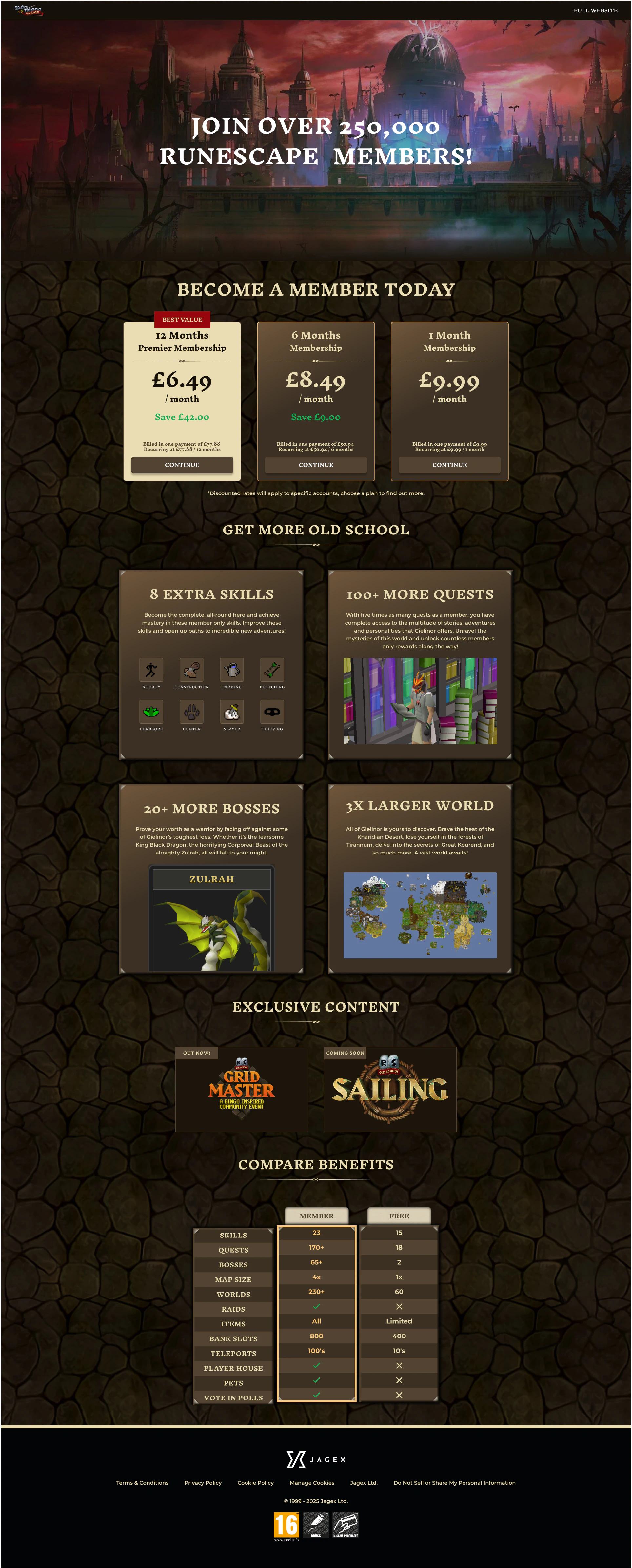
Building on Design A's clarity improvements, this variant added visual weight to the 12-month plan — the highest value option for both players and the business. I introduced visual panels showcasing exclusive member content using in-game imagery, making the benefits tangible rather than abstract. The comparison table evolved to include benefit descriptions, helping players understand not just what they'd get, but why it mattered.
I also incorporated player testimonials from the community, applying the psychological principle that people trust peer recommendations over marketing claims. Seeing real players describe their membership experience aimed to reduce purchase anxiety and validate the decision to upgrade—particularly effective for players hesitant about committing to a subscription.
OSRS Membership Design #D
Prototypes
Use the interactive prototype below to switch between variants and compare side-by-side. Each design tested a distinct hypothesis — from pricing clarity to visual anchoring to social proof, allowing you to see how these improvements evolved.
Testing
We ran the first A/B test comparing the control against Design #A to validate whether plan clarity improvements could impact conversion.
The results exceeded expectations - Design A delivered a significant uplift, confirming that players were being lost to confusion rather than lack of interest. Based on this success, The winning variant was deployed and subsequent tests built on these learnings.
Test #1 - Control vs Design A
Winner: Design #A 🏆
Conversion Rate
Design A delivered a 20% conversion uplift across all channels.
Statistical Confidence
Results reached statistical significance, verifying the uplift accuracy.
Sample Size
Large sample size ensured reliable results across player segments and devices.
Time to Significance
Strong effect size meant the test reached conclusive results within two weeks.
