15gifts Guided Selling
Delivering 61% conversion increase for telco brands
Key Results
- +61% conversion uplift
- 40x ROI for Vodafone
- 1.1M+ recommendations
- 47K direct purchases

Context
As Senior UX Designer at 15gifts, I led UX for Humara — a guided selling tool for major UK/US telco clients including Vodafone, EE, O2, Three, Verizon, T-Mobile, Sky, and Virgin Media. The tool was powered by AI trained on top-performing human salespeople.
The Challenge
Telco customers faced overwhelming choice — hundreds of devices, dozens of plans, multiple contract lengths — resulting in 68% abandonment. Each new client required customisation, but we needed weeks-to-days delivery without sacrificing brand consistency or conversion performance.
Research
Working with our User Researcher, I analyzed telco checkout flows using heatmaps and session recordings, revealing specific abandonment points across plan comparison screens, bundle configuration, and checkout forms.
Key Finding: AT&T Comparison
AT&T's comparison feature was nearly invisible — only 12% of users discovered it. This informed our decision to make comparison prominent and contextual, not buried in navigation.
Personas
We worked with the Vodafone research team to build personas guiding the tool design. Three primary types emerged, each requiring different psychological principles:
- Always wants the newest flagship device and features
- Follows launches, trades in yearly, pre-orders devices
- Drivers include trade-in value, early upgrades, prestige
- Keeps costs low while getting reliable service
- Compares tariffs obsessively, hunts deals, churns easily
- Drivers include clear low-cost offers, transparency, trust
- Loves brand experiences, entertainment, and perks
- Uses loyalty apps, attends events, shares brand content
- Drivers include exclusive rewards, lifestyle alignment
The 7 Psychology Principles
The guided selling engine was designed around seven research-backed psychology principles that mirror how the best salespeople guide customers to confident purchases. By applying these principles systematically across the digital experience, we replicated the effectiveness of in-store experts — delivering a 61% conversion uplift for clients like EE and Vodafone.
Right time, right message
Engage customers when the offer aligns with their goals and motivation — not with a generic greeting.
Conversational Interaction
Adapt the conversation to each customer's behaviour and tone—once engaged, they're more likely to complete a purchase.
Adaptive Learning
Personal recommendations drive purchases — digital channels should learn and improve over time, just like in-store assistants.
Communicating the 'Why'
Customers buy with confidence when they understand why a product fits their needs — messaging should feel helpful, not persuasive.
Social Proof
Purchase decisions are influenced by others' behaviour — especially when customers feel uncertain or identify with those people.
Confidence through Context
Customers decide confidently when they can compare options — how alternatives are framed shapes perception of the primary choice.
Targeted Upsell
Too many choices cause decision paralysis — personalised, limited options improve both primary conversion and upsell attachment.
Design System
When I joined, visual designs existed in separate Sketch files for each client — each created individually without shared libraries or version control. I inherited these static designs and created a scalable Design System — consolidating interaction patterns, content architecture, and question flows into reusable components with theming support.
- Core Product Layer: Universal interaction patterns (questionnaire flow, 3-option recommendation, comparison)
- Brand Theme Layer: Customizable colours, typography, spacing via design tokens
- Client Customization Layer: Specific copy, images, promotional content
The result: New client onboarding went from 3-4 weeks to 3-5 days. We could now accept more clients without expanding the design team.
Final Designs

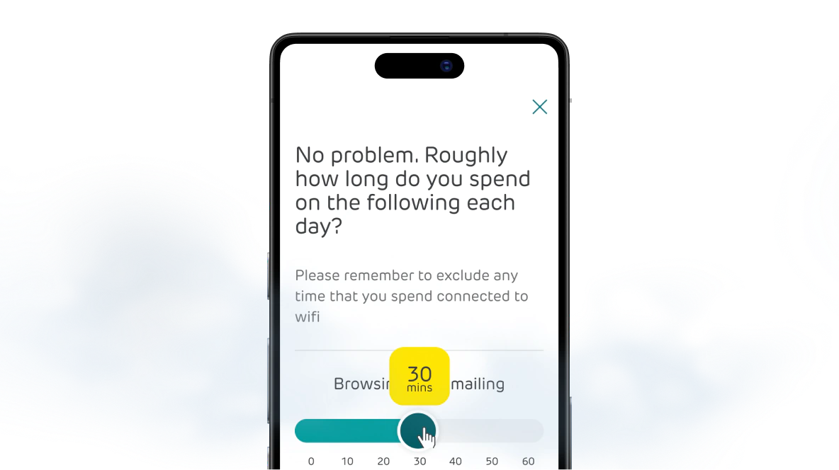
EE mobile question journey
EE Guided Selling Prototype
Product Features
- Engagement — Friendly, conversational signposting that balanced discoverability with distractibility
- Conversation Engine — Intelligent, branching questionnaire with adaptive questions based on previous answers
- Intelligent Analysis — Summarize and replay customer choices to increase trust and confidence
- Personalized Recommendation — Psychology-driven 3-option recommendation using Social Proof and Confidence through Context
Budget-First Approach Validated
By asking budget first instead of device preference, we eliminated price shock:
- Device-First: Users fixated on expensive devices, then abandoned when seeing total cost
- Budget-First: 28% lower abandonment—users saw affordable options from the start
Impact
Exceptional Conversion Results
- 61% conversion uplift for EE customers using guided selling
- 40x ROI for Vodafone (7% of overall sales through the tool)
- 81% addon attachment uplift for entertainment packs
Scalable Growth
- Scaled from 2 to 8+ major UK/US telcos and media brands
- 1.1m recommendations delivered to Vodafone customers alone
- 47k direct purchases through tool, accounting for 7% of Vodafone sales
Design System Impact
- Client onboarding reduced from 3-4 weeks to 3-5 days
- Design team scaled from 2 to 8+ clients without headcount increase
- Consistent conversion performance across all clients
Our partnership with 15gifts and launch of our guided selling tool has been key in enhancing our online customer experience over the last year. The results have been great, with more and more customers using the tool and with an increased conversion rate.
Reflections
Systems Enable Scale
I initially viewed the design system as an efficiency improvement. But it became our competitive advantage — the reason we could scale from 2 to 8+ clients without expanding the team.
Evidence Over Opinion
I wanted to show 5 recommendation options. Testing proved 3 options converted 23% better.
Discipline Over Brilliance
This project taught me that high-impact design isn't about being brilliant — it's about being disciplined.
Tags
Read the full story
See how I applied psychological principles to boost conversion 61%, scaled from 2 to 8+ clients, and delivered 40x ROI.

