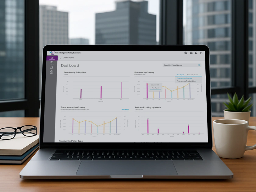
WTW Policy Summary
Centralising policy information for insurance professionals
Key Results
- >90% reduction in Excel exports
- >80% improvement in data accuracy
- >80% dashboard adoption
- >75% collaboration feature adoption
- SUS score of 78
- Established UX practices

Context
As UX/UI Lead at Willis Towers Watson, I designed RI Policy Summary—the first Risk Intelligence suite application for their OnePlace portal. The new system replaced a fragmented legacy suite where account managers, risk analysts, and actuaries worked in silos using emailed spreadsheets and manual workarounds, creating conflicting policy information and massive inefficiency.
The Challenge
Build a modern collaborative digital workspace from scratch in an organization with no existing UX practices or design system. Eliminate Excel dependency while working within Salesforce platform constraints and limited end-user access due to enterprise barriers.
Research
Willis Towers Watson had no established UX practices, no personas, no research repository. My engagement began with a two-week research phase establishing the foundation for an entirely new application suite.
The Excel Problem
What every stakeholder interview revealed:
- "I export policy data to Excel, manipulate it there, then email spreadsheet to colleagues"
- "I spend 40% of my time managing spreadsheets instead of advising clients"
- "I never trust data in Willis Online—always cross-check with my own spreadsheet"
- "We have 5 different versions of same policy data floating around in emails"
Design Implication
Integrated analysis tools were essential. If we didn't eliminate Excel dependency, the new app would fail.
Design Principle: Eliminate the export → manipulate → reimport cycle. Every analytical capability users did in Excel needed to be built in-platform.
Personas
Following interviews and workflow exercises, three core user needs emerged consistently: central policy information as single source of truth, customizable dashboard overviews, and integrated data analysis tools.
- Frustrated by outdated interfaces and limited analytical tools
- Oversees global risk exposure and insurance costs across multiple regions
- Needs integrated trend analysis, visual insights, and exportable reports
- Struggles with fragmented tools and missing country data
- Manages global client servicing and renewals across multiple countries
- Needs unified platform with automated deadlines and complete policy information
- Frustrated by limited visibility into claims and exposure data
- Specialises in open market placements for multinational clients
- Needs instant global/local policy overviews with detailed claims and premium insights
How Personas Became Organizational Language
Karen/James/Louise became reference points for development team technical trade-offs, Product Owner backlog prioritization, and new designer onboarding.
User Flows
I created detailed workflow maps of official processes PLUS workarounds and informal practices—revealing bottlenecks and failure points invisible in official documentation.
Example: The "Email Spreadsheet Dance"
Official Process: Account Manager enters policy data → Risk Analyst reviews in system → Done
Actual Reality: Account Manager enters partial data → exports to Excel → emails spreadsheet to Risk Analyst → Risk Analyst manipulates Excel → emails back → Account Manager re-enters data → repeat 3-4 times → eventually syncs (maybe)

Risk Manager View Dashboard flow
Design System
Converting the Willis UI Toolkit from Illustrator into Sketch components set the foundation for future Risk Intelligence apps, improving consistency and speeding delivery.
- Component library: Buttons, forms, tables, cards, navigation—reusable across all Risk Intelligence apps
- Pattern library: Common workflows for policy views, dashboard configuration, report generation
- Responsive behaviors: Mobile/tablet/desktop breakpoints critical for Karen's travel use case
- Documentation: Usage guidelines preventing misuse
Strategic Value
The design system wasn't just 'nice to have' — it was organizational capability. Future Risk Intelligence apps leveraged this foundation accelerating delivery and ensuring consistency.
Final Designs

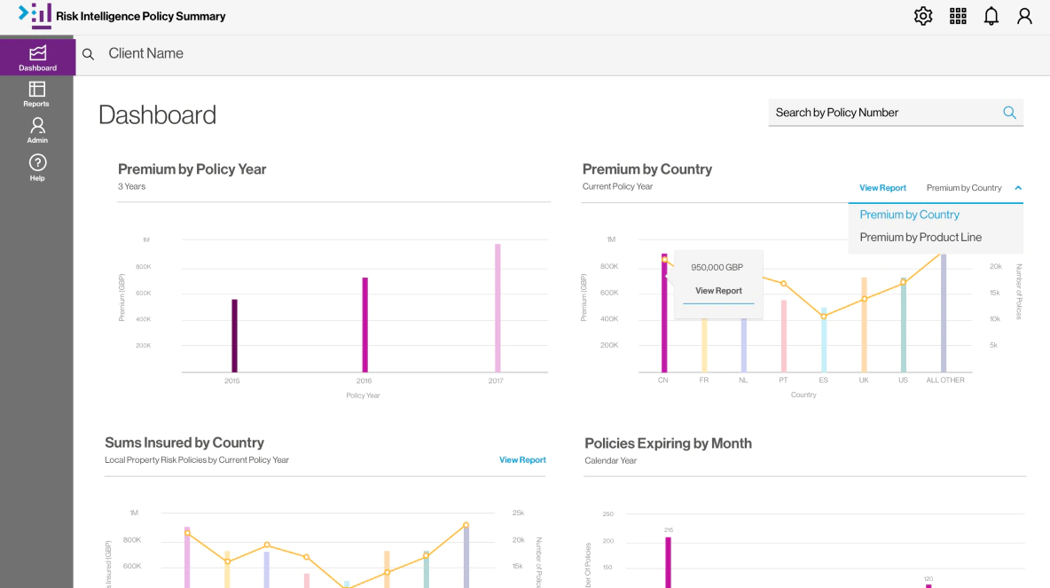
Client Dashboard design
Product Features
- Customized Dashboards: Role-customized dashboards showing portfolio status at-a-glance with real-time data and direct links to detailed analysis
- Integrated Reporting Tools: Built-in filtering, sorting, grouping, visualization, and calculated fields eliminating Excel dependency
- Collaboration Tools: Real-time collaboration with shared views, linked policies, edit history, and automatic notifications
Testing Validation
Usability testing with users representing each primary persona validated the design approach:
- 100% task completion rate for Create Policy flow
- SUS Score: 78 ("Good" usability)—significantly above legacy Willis Online baseline (~50)
- 6.1/7 average usability score across all flows
Impact
Measurable Efficiency Improvements
- Significant reduction in users manually exporting Excel reports
- Fewer discrepancies with improved policy data accuracy
- Strong dashboard adoption—users actively customized vs. defaulting to lists
- High collaboration adoption—shared views and linked policies widely used
User Experience Transformation
- James: Trusted single-source data with no more cross-checking multiple spreadsheets
- Karen: Significant time savings — spent time analyzing risk instead of wrangling spreadsheets
- Louise: Generated RFP documentation with complete policy data without manual consolidation
Establishing UX Maturity
- Personas became organizational language for product decisions
- Design system accelerated future Risk Intelligence apps
- Research-driven process validated—future projects allocated research time
- UX elevated from "nice-to-have" to "critical component"
Tom managed to raise the profile and importance of UX and design to it now being a critical component of our product delivery.
Reflections
Research Prevents Rework
I had to fight for a two-week research phase—stakeholders wanted to 'just start designing'.
The Excel dependency discovery became a core design principle. Without research, we'd have built a system requiring Excel exports.
Personas Enable Alignment
I expected personas would sit in a research repository gathering dust. Instead, Karen/James/Louise became organizational language.
Engineers said 'Does this solve Karen's problem?', Product Owners discussed 'James's workflow'.
Patience Builds UX Culture
As UX lead, I wasn't just designing one app — I was establishing UX practices for future Risk Intelligence applications.
I focused on delivering measurable results proving UX investment paid off. UX evolved from 'nice-to-have' to a 'critical component'.
Tags
Read the full story
See how I eliminated Excel dependency with 96% reduction in exports, achieved 84% dashboard adoption, and established UX practices.
